Add Drawer To Material-UI Navbar - Part 2
January 22, 2021
If you direct land on this page, please check out part 1 before you continue this part.
Add drawer component to navbar and make it mobile responsive
Add “scroll to hide” & “back to top” feature to Material-UI navbar
Create side drawer
Create src/components/SideDrawer.jsx. Why I don’t just name it Drawer.jsx is because Material-UI has a component with the same name.
Initial the component,
import * as React from "react"const SideDrawer = () => {return}export default SideDrawer
In order to see how our work is going on in visual
Go to src/components/Header.jsx and:-
import SideDrawer from "./components/SideDrawer"
Comment out the List component and add SideDrawer component below it
{/* <Listcomponent="nav"aria-labelledby="main navigation"className={classes.navDisplayFlex}> ...</List> */}<SideDrawer />
Then go back to SideDrawer component and start working on it
We going to import the Material-UI component we going to use and a hamburger menu from Material-UI icons
Hamburger Menu Icon
import { IconButton } from "@material-ui/core"import { Menu } from "@material-ui/icons"
const SideDrawer = () => {return (<React.Fragment><IconButton edge="start" aria-label="menu"><Menu /></IconButton></React.Fragment>)}
You can choose “end” or “start” for the edge. It just align the menu a bit right or left. I tested both, and find out at “start” look better in this project.
Save the file and you should see a hamburger menu show up

Next, we’re going to add onClick event listener to toggle the drawer when visitor click the menu button
Add toggle drawer
import { useState } from "react"
Add state and toggle function
const SideDrawer = () => {const [state, setState] = useState({ right: false }) // Add thisconst toggleDrawer = (anchor, open) => event => {if (event.type === "keydown" &&(event.key === "Tab" || event.key === "Shift")) {return}setState({ [anchor]: open })}return {/*rest-of-code*/}}
This “anchor” thing is Material-UI props to decide the drawer slide in from top, left, right or bottom.
Then add toggle function to IconButton component
const SideDrawer = () => {return (<React.Fragment><IconButtonedge="start"aria-label="menu"onClick={toggleDrawer("right", true)} {/* Add this*/}><Menu /></IconButton></React.Fragment>)}
Side drawer list
Since we’re going to use the same navLinks, we can grab the data from it parent.
Go to Header component and pass navLinks as props
<SideDrawer navLinks={navLinks} />
then destructure the data in SideDrawer component
const SideDrawer = ({ navLinks }) => {...restOfCode}
Use the data to create SideDrawer as below:-
const toggleDrawer = (anchor, open) => event => {...};const sideDrawerList = anchor => (<divclassName={classes.list}role="presentation"onClick={toggleDrawer(anchor, false)}onKeyDown={toggleDrawer(anchor, false)}><List component="nav">{navLinks.map(({ title, path }) => (<a href={path} key={title} className={classes.linkText}><ListItem button><ListItemText primary={title} /></ListItem></a>))}</List></div>);
Important:
Please do not use anchor tag for internal navigation in your React.js project. I use it for demo purpose only. My real project is using Link component from Gatsby.js, you can always use your favourite library such as reach/router, react-router or other similar libraries.
Add style
import { makeStyles } from "@material-ui/core/styles"
Create an useStyles variable below all the import statement
const useStyles = makeStyles({list: {width: 250,},linkText: {textDecoration: `none`,textTransform: `uppercase`,color: `black`,},})
Then call it inside the component and assign to classes variable
const SideDrawer = () => {const classes = useStyles(); // Add this...restOfCode}
Then apply them to
const sideDrawerList = anchor => (<divclassName={classes.list} /*Add this */role="presentation"onClick={toggleDrawer(anchor, false)}onKeyDown={toggleDrawer(anchor, false)}><List component="nav">{navLinks.map(({ title, path }) => (<a href={path} key={title} className={classes.linkText} /*Add this*/><ListItem button><ListItemText primary={title} /></ListItem></a>))}</List></div>)
Next, we going to create the drawer by:-
import {..., Drawer } from '@material-ui/core'
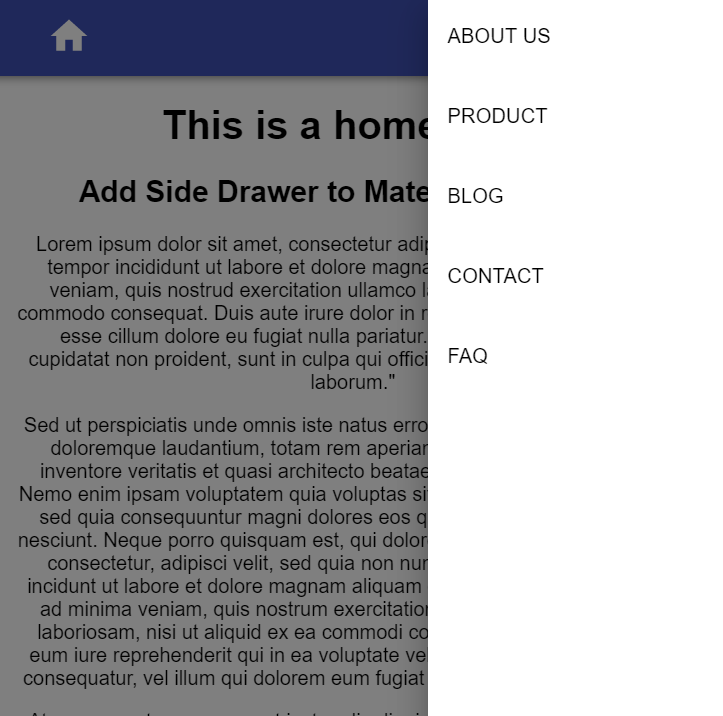
What we want is when the menu button is clicked, the drawer slide in from the right. Add the following code below IconButton
<IconButton...</IconButton><Draweranchor="right"open={state.right}onOpen={toggleDrawer("right", true)}onClose={toggleDrawer("right", false)}>{sideDrawerList("right")}</Drawer>
Save and click the menu icon, you shall see

Well, the menu icon is working, we need to style it to match our home icon
<Menu fontSize="large" style={{ color: `white` }} />

Uncomment the List component in Header Component
<Listcomponent="nav"aria-labelledby="main navigation"className={classes.navDisplayFlex}> ...</List><SideDrawer />

How could we just show the main navigation in tablet and desktop but only show hamburger menu in mobile?
Go to Header component and:-
import { ..., Hidden } from '@material-ui/core'
Then wrap the List and SideDrawer component.
<Hidden smDown> {/* This*/}<List>...restOfCode</List></Hidden><Hidden mdUp> {/*This */}<SideDrawer navLinks={navLinks} /></Hidden>
This Hidden component will hide the List component when the screen is smaller than “sm”. And hide the SideDrawer component when the screen is bigger than “md”
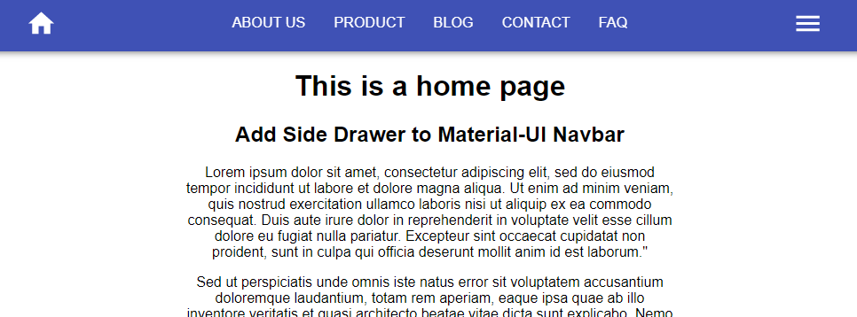
Wala, check the navbar with different viewport now
You should see the hamburger hidden in tablet and desktop screen size, and show in mobile screen size.
In case you want to know what is the breakpoints of the screen size for “sm” or “md”, you could check out Material-UI docs
Check out the code:-

Let’s go to part 3