How To Build A Material-UI Navbar - Part 1
January 22, 2021
This article is a 3 parts tutorial to create a production-ready Material-UI’s Navbar with some modern features.
Create a Header component and navbar for desktop
Note:
Please note that part 1 is not production-ready. Please do not use it in your project. We are crafting a navbar in Header component and it’s not mobile friendly yet.
Let’s get started!
Install Material-UI dependencies into your React’s project.
npm install @material-ui/corenpm install @material-ui/icons
Create src/components/Header.jsx.
You can just use JS extension. If you want to use the Emmet feature and JS extension. You can add the following code in your VS Code JSON setting.
"emmet.includeLanguages": {"javascript": "javascriptreact",},
Create A Navbar
I create navigation links variable in the Header component. You could also create a JSON or JS file separately and import it to the Header component. Since this is a small project, create the nav links in the component let us work easier.
const navLinks = [{ title: `about us`, path: `/about-us` },{ title: `product`, path: `/product` },{ title: `blog`, path: `/blog` },{ title: `contact`, path: `/contact` },{ title: `faq`, path: `/faq` },]
Initial Header component to create a navbar:-
import * as React from "react"import { AppBar, Toolbar } from "@material-ui/core"const navlinks = [{...},]const Header = () => {return (<AppBar position="static"><Toolbar></Toolbar></AppBar>)}export default Header
Save the file and go to src/index.js, import Header component and add it above App component.
//index.jsimport Header from "./components/Header"const rootElement = document.getElementById("root")ReactDOM.render(<React.StrictMode><Header /> {/*Add this*/}<App /></React.StrictMode>,rootElement)
Save the index.js file, you should see a blue colour navbar appear

If you see gap surrounded the navbar.
Add the following code to your global CSS file
* > body {margin: 0;box-sizing: border-box;}
Or you could use Material-UI’s CssBaseline component to reset the browser’s initial CSS value. Something like normalize.css
You just need to add the code:-
//index.jsimport Header from "./components/Header"import { CssBaseline } from "@material-ui/core"const rootElement = document.getElementById("root")ReactDOM.render(<React.StrictMode><CssBaseline /><Header /> {/*Add this*/}<App /></React.StrictMode>,rootElement)
Add logo
Since I don’t have any logo for this project, I will just use a home icon act as a logo. In fact, I often use this home icon in my real project to make it obvious to visitor, this is a click to the home button.
import { ..., IconButton } from "@material-ui/core"import { Home } from "@material-ui/icons"
Then add the following code inside Toolbar component
const Header = () => {return (<AppBar position="static"><Toolbar>{/* Add code */}<IconButton edge="start" color="inherit" aria-label="home"><Home fontSize="large" /></IconButton>{/* Add code end */}</Toolbar></AppBar>)}
Save the file, you should see the home icon show up
![]()
Add Navlinks
import { ..., List, ListItem, ListItemText } from "@material-ui/core"
Add the following code inside Toolbar component
<Toolbar><IconButton edge="start" color="inherit" aria-label="home"><Home fontSize="large" /></IconButton>{/* Add code */}<List component="nav" aria-labelledby="main navigation">{navLinks.map(({ title, path }) => (<a href={path} key={title}><ListItem button><ListItemText primary={title} /></ListItem></a>))}</List>{/* Add code end */}</Toolbar>
Important
Please do not use anchor tag for internal navigation in your React.js project. I use it for demo purpose only. My real project is using Link component from Gatsby.js, you can always use your favourite library such as reach/router, react-router or other similar libraries.
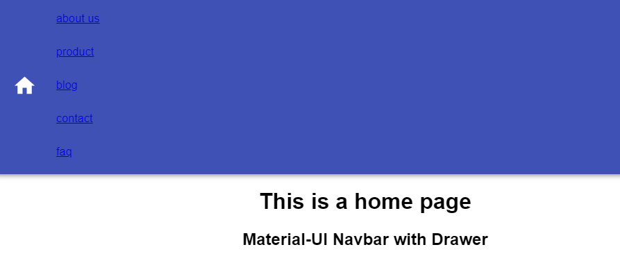
Save the file again, you should see

What a mess, everything squeezes together,
Let’s apply some styling to make it look nicer, I use Material-UI’s makeStyles hook API to write CSS-in-JS
import { makeStyles } from "@material-ui/core"
Create an useStyles variable below all the import statement
const useStyles = makeStyles({navDisplayFlex: {display: `flex`,justifyContent: `space-between`},linkText: {textDecoration: `none`,textTransform: `uppercase`,color: `white`}});navlinks = [...]
Then call it inside Header component and assign it to classes variable
const Header = () => {const classes = useStyles(); // Add this...restOfCode}
and apply like so:-
<Listcomponent="nav"aria-labelledby="main navigation"className={classes.navDisplayFlex} // this>{navLinks.map(({ title, path }) => (<a href={path} key={title} className={classes.linkText} {/* this */}><ListItem button><ListItemText primary={title} /></ListItem></a>))}</List>
Save the file and you will see
![]()
How could we align the navigation links to the right? Before this, let’s add a Container component to wrap home icon and navigation links. You will know why we need to add this component later.
import { ..., Container } from "@material-ui/core"
and wrap IconButton & List component like this
<Toolbar><Container><IconButton>...</IconButton><List>...</List></Container></Toolbar>
Afterwards, add this CSS code’s object into makeStyles function
const useStyles = makeStyles({navbarDisplayFlex: {display: `flex`,justifyContent: `space-between`},..restOfCode});
Apply it to Container component
<Toolbar><Container className={classes.navbarDisplayFlex}>...restOfCode
Save the file and you will see

They’re too close to the left and right edges and space quite far away. How could we make them closer toward the center?
Just apply maxWidth to Container component will do, this is the purpose I add Container component earlier.
<Toolbar><Container maxWidth="md" className={classes.navbarDisplayFlex}><IconButton>...</IconButton><List>...</List></Container></Toolbar>

You could choose your maxWidth from “xs”, “sm”, “md”, “lg”, and “xl” to find out which distance suit your best.
In case you want to know what is the breakpoints of the screen size for “sm” or “md”, you could check out Material-UI docs
Check out the code at CodeSandbox